It's All About the Presentation: Maps and Data Making Job and Life Simpler
It's All About the Presentation: Maps and Data
Making Job and Life Simpler
Maps are seen by their readers as neutral carriers of information, and thus have the power to persuade without appearing to do so "because the myths they contain are naturalized within the system of 'facts'." -- William Owen, quoting in part Denis Wood -"The Power of Maps"
I have found that most people in the engineering and environmental industry tend to be map geeks. I don't mean "geek" in a derogatory way. The word "geek" can be considered a complement since geeks seem to be the richest and most powerful people in the world, these days.
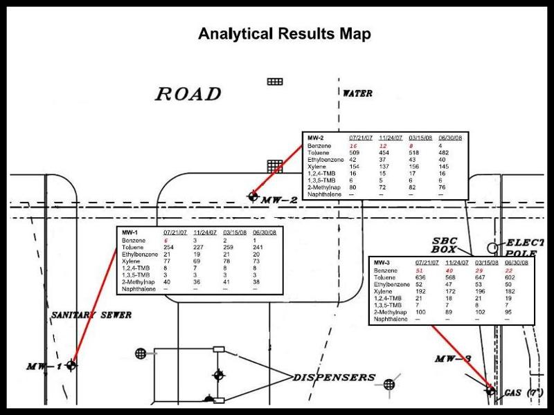
For people in the engineering and environmental 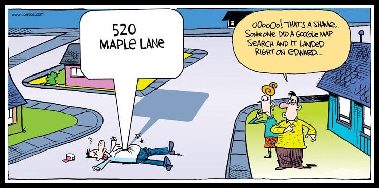 business, we know a well managed project starts with a good base map. Knowing where things are located in relation to other site features is critical. State of the art GPS survey technology is helping make very precise base maps. In addition, we "geeks" know that a map is basically a picture and that "one picture is worth a 1,000 words".
business, we know a well managed project starts with a good base map. Knowing where things are located in relation to other site features is critical. State of the art GPS survey technology is helping make very precise base maps. In addition, we "geeks" know that a map is basically a picture and that "one picture is worth a 1,000 words".With the advent of Geographic Information Systems (GIS), presenting geographical data is a lot simpler than it was in the past. Maps are an excellent means of presenting information. Not only are they visually attractive, they also make it easier for the end user to relate data to a location and help identify trends in that data. There are other ways to present data and visualize trends as well. For example, tables and graphs are also commonly used. The bottom line is that various maps, tables and graphs are efficient graphical ways to present data.
A couple of my favorite data presentation web sites are Information is Beautiful and Geo.Data.Gov. Be careful if you choose to visit these sites, if you're a geek like me you can waste allot of time there. 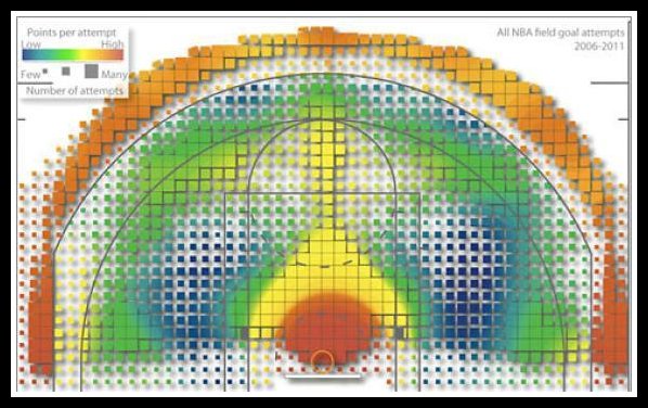 One graphic that I thought was timely, given that we are in the middle of NCAA March Madness (my bracket, by the way, is not doing so hot), is this graphic of where points are made on an NBA basketball court. This graphic averages all points across all teams over several years. The way data can be presented is limitless and people are thinking up new ways every day. It's amazing.
One graphic that I thought was timely, given that we are in the middle of NCAA March Madness (my bracket, by the way, is not doing so hot), is this graphic of where points are made on an NBA basketball court. This graphic averages all points across all teams over several years. The way data can be presented is limitless and people are thinking up new ways every day. It's amazing.When trying to convey geographic related data one "picture" can be worth 10,000 words. However, getting from the data collection to the finished graphical report (map, table and graph) can be considerable. From my experience working in the engineering/consulting industry, the GIS/AutoCAD bottleneck and financial aspects associated with preparing the maps, tables and graphs can be significant. That is of course unless you're using SampleServe.com.
One of the common misconceptions about SampleServe.com is that we are just a sampling company. Yes we are a sampling company, but we are also so much more. We are also a software company. Our software helps you prepare the maps, tables and graphs that you need in significantly less time than the typical GIS/AutoCAD department (ours are done in about 15 seconds).
 |
| Select the chemicals you want to see and Clean Up Criteria you want to compare to. |
 |
| Simply select the clean up criteria you want to compare to and it's all completed in about 15 seconds. |
We are also a logistics company. Another major aspect of what we do is the logistical services we offer for sampling projects. You tell us the site location, the wells you want sampled, which lab you want to use and the analytical parameters you want tested and we handle the coordination and logistics from there, while keeping you informed along the way. All of our employees are well trained, experienced, degreed professionals. Spend your time on the science of the project, not managing employees and logistics. Once your lab data is complete, log in and print your maps, tables and graphs. Sounds too simple? Well, actually it is that simple. We can handle sites with several hundred wells to sites with just a few wells. Go to sampleserve.com and log in as a guest to review some example sites and run some reports for yourself.
I would be happy to provide you with references and quote you a price. Just call or e-mail for a quick response.
Russell Schindler
231-933-7035


Comments
Post a Comment